Greg Christopher does a fair bit of layout, and recently commented on google+
It feels weird for me to have an entire spread that I am working on with just text. I feel like there has to be a chart or an image to break up the spread in some way. Is that normal or should I try to get over it?
I think it depends on exactly what you’re laying out. There are times where having text broken up helps, and times I think it doesn’t help so much.
For gaming purposes, since that’s specifically what he’s looking at, I am generally okay with significant wall of text. It’s good to have some breaks, but they don’t need to be big, just enough to interrupt the wall. I sometimes feel like ‘modern’ RPG documents often have too much interruption in the text.
I consider RPG books to often serve a purpose similar to technical books. A wall of text, if that is what is needed, is fine. Often it is not, because technical documentation often has a lot of headings, which I find to be sufficient separation. I find tables and the like can also serve to sufficiently break up text, especially when it summarizes the material being described in the text.
Graphics… not so much. Specific graphics are useful, such as in the D&D 3.x Player’s Handbook where the graphics illustrate cover rules (though this may suggest the cover rules should perhaps be simplified), but while general art can be evocative it might work better as chapter or section heads than space filler.
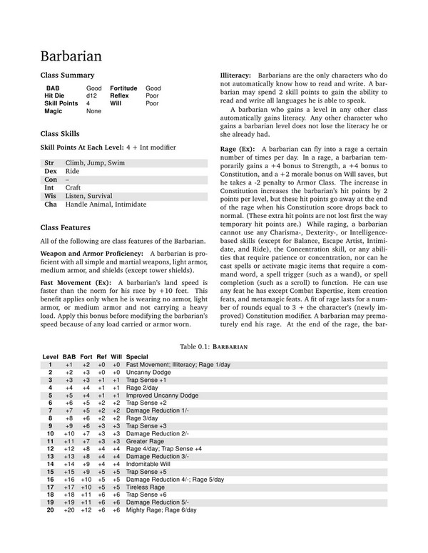
I’ve included a PDF I made years ago for a campaign I was playing in, so I didn’t need to bring the entire book with me. It just has a few of the classes from the Revised System Resource Document. There are some interruptions to the body text, where there are natural breaks in the text, but there are still a few walls of text (Bard class description especially). There are a few places where there is room for a picture or something (bottom of the Barbarian and Monk class entries, and the variant Monk combat styles — pages 2, 10, and 12) but I am fairly satisfied with the empty space. I think stuffing heavy art in those places could overfill the pages, while having art for some but not all of the classes might look inconsistent.
Mileage varies, of course.

I am very interested in this topic.
In my alchemy work, I am looking to have illustrations on nearly every page. Since I’m doing them all, they are directly related to the text.
I’m reading that you’re saying this is a bad idea? Do you have any suggestions on how to do something like this successfully?
Not necessarily a bad idea, and particularly not with what you’re doing.
If I’m not mistaken, in your case you’re describing a number of alchemical items. Having an image for each one makes sense — if you wanted, you could fairly reasonably lay it out something like a catalog, with image and description presented next to each other. I don’t think I’d lay it out with the image ‘somewhere near’ the description, I don’t really like it with WotC books where I find a description then have to look around for the matching picture (if present at all), and even less when there is a picture and I have to look around for the description.
What I was getting at is that I don’t feel that text necessarily has to be broken up. If there is naturally a long description or explanation I would not introduce other graphical elements for the specific purpose of breaking up the text. However, I also think that long text blocks in RPG text that have no natural breaks suggest something too long-winded. If it’s a spell description and it takes enough paragraph text to fill a column, it’s probably too damn complicated for the way it’s being presented, or poorly written. I would look to tighten up the text (partial rewrite), simplify the material (simple rules need less explanation), or find another way to represent the material.
Long ago, mathematical formulae were not written in the form we use today using variables, but described. Pythagoras’ theorum was a fairly ugly paragraph rather than the simple “c^2 = a^2 + b^2” we use today.
For your alchemical items, as I recall they are displayed on your site as a simple table summarizing the mechanics, plus a picture, and some explanatory text. I think there is likely enough whitespace there to avoid wall of text. The pictures can be evocative and add to the visual appeal, and I think them appropriate for the content… but I don’t think they are needed in order to keep the page visually balanced and attractive.
That is, it can look good without graphics. For what you’re doing, I think it could look better with graphics.
Pingback: Weekly Assembly: Two Doctors for Marvel | The Gamer Assembly