
Until now, my workflow has included TikZ options in my taxonomy file. This worked well enough, as far as it went, but were at the ‘actual options’ level. That is, the detailed information, including color names and the like, that would go into the LaTeX source on conversion.
This ended up being more detail than I care to remember. I don’t have to go in there very often, so when I do, I need to remind myself. what’s what.
I’m moving that detail out of the taxonomy file and moving it to my LaTeX style file. Instead of the actual TikZ options, I’ll set up styles for the bits I need.
That will mean setting up some styles, but that’s not a problem.
Document Styles
Not related to the data, but I do use TikZ (by way of mdframed) for document elements.
- Document structure styles for part, chapter, section, subsection, subsubsection. I actually don’t often use ‘part’, but I’d like it to look better than the default.
- I expect to change the shape of the nodes.
- Tables have often been wrapped in TikZ nodes. I’ve changed the style a few times.
- Page dress? I’ve always used basic headers and footers, I feel I know enough now to do better.
Document color schemes are usually based on the product line. Echelon Reference Series uses browns, Echelon Explorations uses blues, Echelon Expansions has a whitish cover but browns internally. These colors reflect the nature of the content.
Game Content Styles
I don’t think the node and heading shapes will change much, but the definitions will. When I first started, the colors were named after their families, and node shapes after the object types. That is, ‘featnode’ used ‘egdBodyBrown’.
I’m still going to define colors, but I won’t be using those directly in the taxonomy. Instead, I’m going to make styles that use those colors, and use those styles in the taxonomy.
Color Themes
Different content types use different color themes. Each theme has four colors, from dark to light. I’m thinking of taking it to five.
- Character options (race, class, features, feats, skills): browns.
- Magic (spells and magic items, mostly, but can include other powers): purples.
- Creatures (characters, monsters, and templates): reds.
- I might move hazards such as traps into this group.
- Setting (deities, places, etc.): blues.
- ‘Modifiers’ (archetypes, subdomains, etc.): greens.
- Mythic (feats, spells, etc.): golds.
The color names were generally of the form ‘egd<Theme><Use>’. For instance, the brown theme had
- egdBrownTitle (very dark, used for major items including class headers)
- egdBrownMid (a step lighter, used for main components of major items: class features, etc.)
- egdBrownSub (a step lighter again, but text is still white for contrast, for subcomponents: class subfeatures)
- egdBrownBody (light enough to move to black text, used for very common object headers such as feats).
I’ll keep ‘egd’ (EchelonGameDesign) and the theme color (‘Brown’), but replace the last bit with a letter or number. ‘egdBrown2’ is the second level of the brown theme. Much easier.
Object Themes
In the past, I’ve always managed to color mappings to objects explicitly. The Feat entry in the taxonomy said ‘background egdBrownBody, text black’, while Class said ‘background egdBrownTitle, text white’. I’m changing that. The taxonomy will work by category.
- ersCharacter# styles for character options.
- ersMagic# for magic.
- ersMonster# for monsters and characters (might call it ersCreature, but Monster is more different from Character).
- I believe I’ll keep monster templates here, rather than under ‘modifier’. Modifiers are more for variant elements, rather than rules for changing arbitrary things.
- ersSetting# for setting material.
- ersModifier# for modifiers.
- ersMythic# for mythic objects.
For example, character option styles include
- ersCharacter1 style for class and race.
- ersCharacter2 style for next level down (class features).
- ersCharacter3 style for next level down (class subfeatures).
- ersCharacter5 style for lowest level (feats).
I expect to have different styles for object headers and object nodes. I had originally thought of adding ‘Header’ or ‘Node’, but instead I think I’ll just go with letters.
Print Styles
Even after colors are identified, how they are applied can vary. I can see ‘printer friendly’ and ‘printer hostile’ settings.
- ‘Printer friendly’: Fill is white, text is dark (black, or Theme1), borders are in color.
- ‘Printer hostile’: Fill is in color, text is dark or light (to contrast with color), borders are in color. I’ve used dark borders in the past, but I think I’ll go with light borders in future.
All of the above can be configured independently. I can have hostile objects and friendly nodes, or vice-versa. In the past, I’d have to change the taxonomy entries. Now, I can make it a document setting.
Document headings can have multiple options. I’m still thinking about this one.
Sample Nodes
I rendered the nodes in all the styles mentioned above. I’ve got two or three color sets for each object class. The first color set is based on Brewer colors, the second and third are color sets I defined long ago. Except red, I never actually got around to using it.
Character Choices
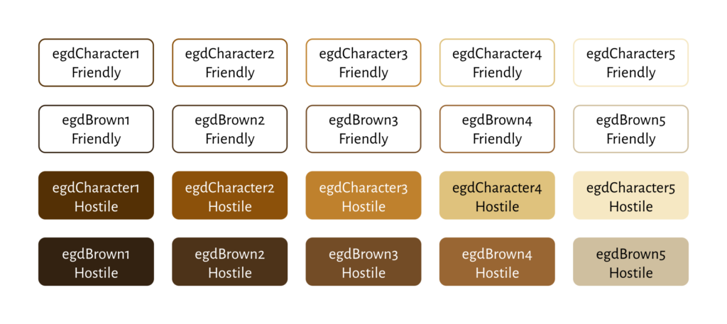
By far the most-used color scheme in the Echelon Reference Series. This should be expected, the entire thing started as an effort to capture character options.
Magic
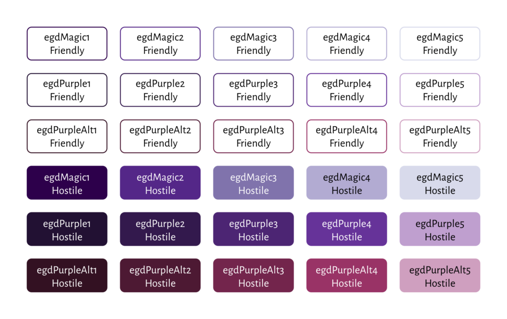
Probably the next most-used scheme, simply because entirely 1/8 of the data objects I’ve captured are spells. Overall the scheme is outmatched by character choices (feats are 1/10 of the data objects, after all), but still common.
Creatures
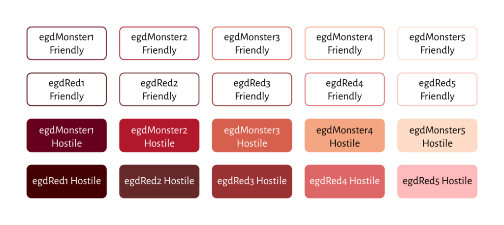
I hadn’t used red before, and I’m a little torn. I feel both that the reds I’ve chosen should be more vivid, and that it would be too much. I’m sticking with the more muted reds for now.
Setting
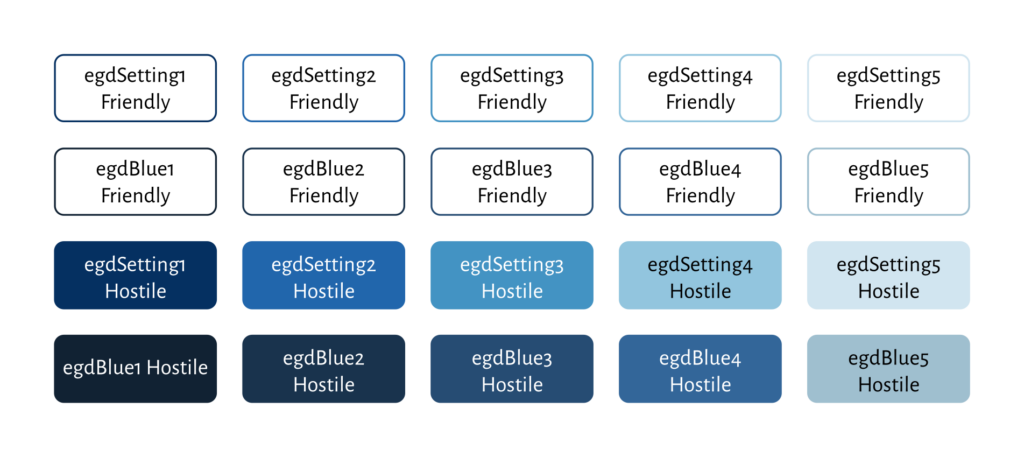
This scheme as mostly been used in Polyhedral Pantheons. Setting material is often, or usually, Product Identity, so I’ve mostly not included it in the Echelon Reference Series.
Which seems a shame, the blues look nice in my eyes. If I have a greater need for them, I can swap in different scheme for setting information.
Modifiers
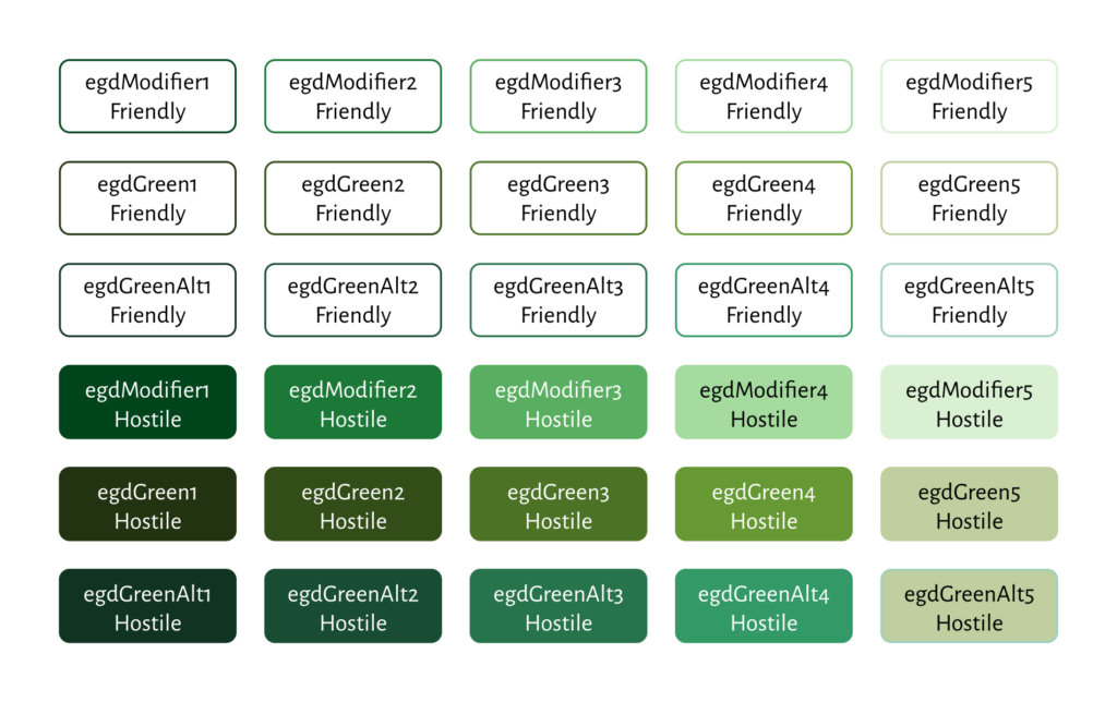
Another busy one. There is a shockingly large number of archetypes out there, and they all have class features. Subdomains the like also exist, but they’re pretty uncommon. Mythic variants and monster templates are both marked with other colors (red and gold schemes, respectively).
Mythic
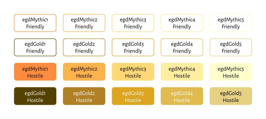
The gold scheme is a little lighter than the others, it’s hard to have really dark gold. The white text is harder to read on the Gold3 and Gold4 colors. I might need to switch them back to black text, unlike all the other schemes. I can live with it — the Brewer yellow-orange (closest scheme to gold) is black all the way across.
Assessment
All things considered… I think Brewer colors show more differentiation. The utilitarian part of me wants to lean into them, for that reason.
On the other hand, I think my original color sets generally look better. I desaturated them a little, which is part of why they aren’t as differentiated, but they’re easier on the eyes.
This is even more evident in the printer friendly versions. It’s not really easy to see the small differences in color when you have only the borders of the nodes. On the other hand, I’m not entirely certain that’s really important.
I think I’m going to stick with my original colors. I’ve got some alternates for some schemes (different purples, different greens) but I prefer the originals.
Implementation Thought?
I might not use the full style name, even. Instead, I just realized I can save myself some trouble by identifying ‘object class’ and ‘color index’, and stop there. I want to keep the colors in step with each other. That is, whatever color I use for feats, I want to use that for feat headers and for feat nodes.
This means I can use “Feat: class=character, index=5” in taxonomy. I can readily translate this to egdCharacter1 style for the headers and egdCharacterA style for the nodes. Even then, exactly what that means (friendly or hostile) depends on the document settings.
Closing Comments
I think this will make my life a lot easier, from a design perspective. It greatly simplifies how I assign and manage the configuration, and I don’t need to remember as much. It also makes it easier to make sweeping changes in appearance, by letting me change style definitions.
It does mean updating my taxonomy file, but even that’s not terrible: the settings are so much simpler now.