
In my latest post I compared many color schemes for my diagrams. I talked about ‘printer friendly’ and ‘printer hostile’ styles, but I hadn’t tried the friendly versions.
Header Design
My object headers have six components. I’ll describe the common application of each element, though some objects have variant applications that aren’t important today.
- Object header bar. Printer hostile are filled, printer friendly are unfilled.
- Border surrounding the entire header.
- Object name, always present.
- Level marker, shows the minimal level you can gain the object.
- Types marker, showing object classifications (Item Creation feats, Ex/Sp/Su abilities, etc.)
- Stat block. Usually includes any prerequisite lists, may have TL;DR blocks, and many game objects have specific stat block contents.
Header Comparisons
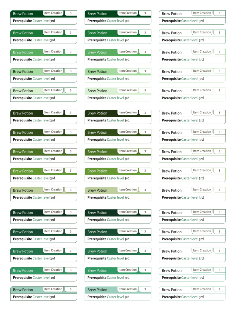
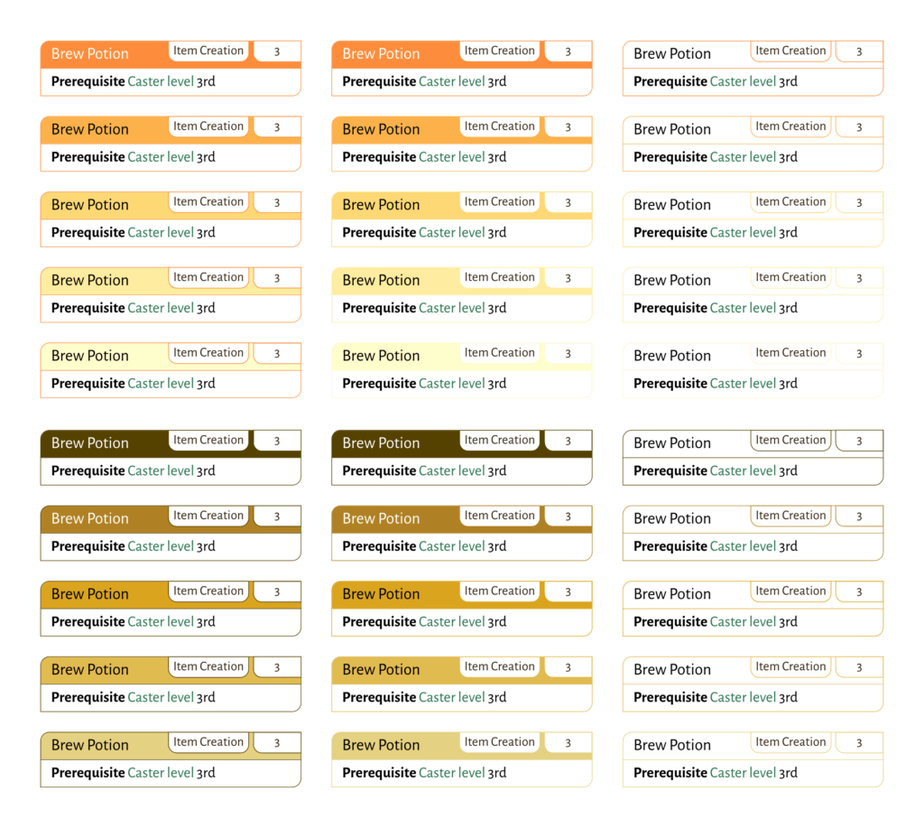
As with the node styles, I arranged some object header comparisons. Because of how they’re used, I had to arrange them differently.
As with the nodes, I’ve got at least two versions of each theme, each with five colors. The first color set of each has Brewer colors, and the second has colors I found years ago. The third set, if present, is an alternate to the second.
The first column of each color theme is ‘hostile’, with a border color equal to the theme title color. The second column is hostile, with a border color equal to the fill color. The third column is ‘friendly’, with only a border, color equal to ‘fill’ color of the hostile versions.
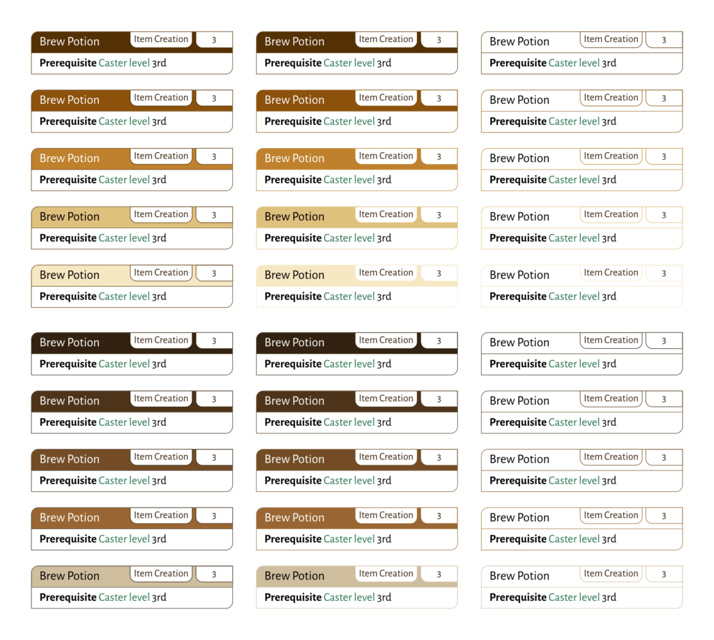
Character Options
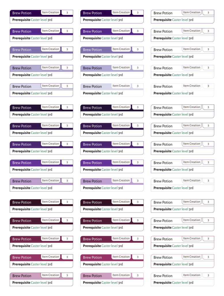
Magic
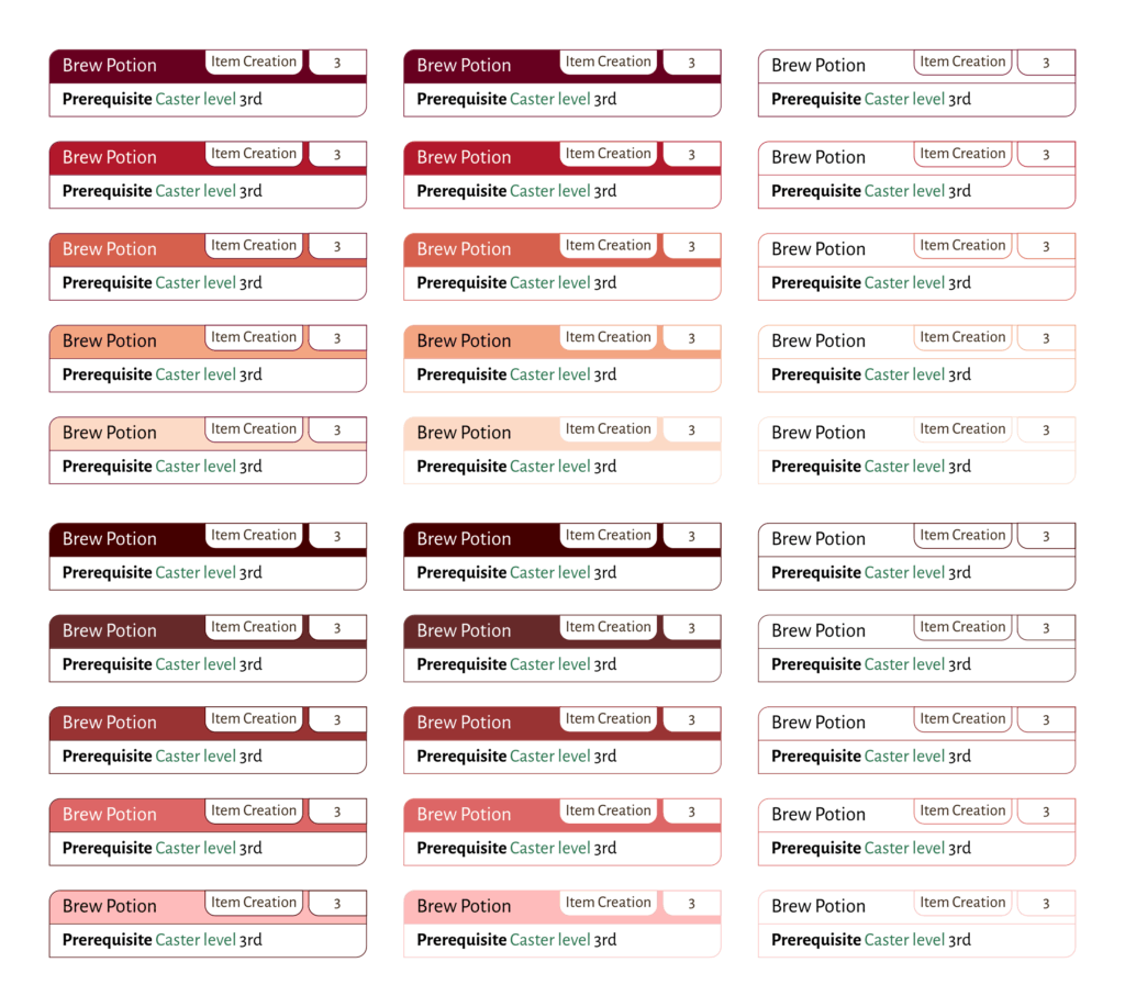
Monsters
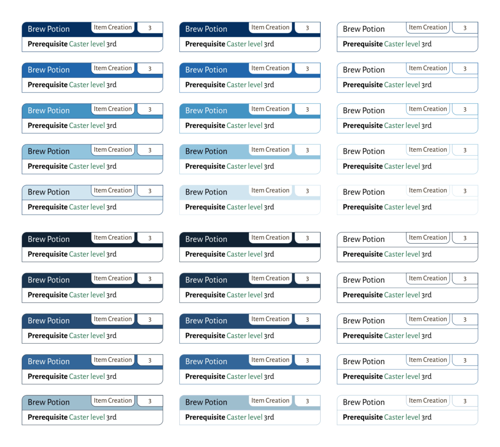
Setting
Modifiers
Mythic
Observations
Almost always, I like the look of the colors I’ve been using. They are the most pleasing to my eyes. In most cases, though, the Brewer colors are much more distinguishable, even in just the hostile form. In friendly form it’s not even a fair comparison. I usually can’t discern differences between adjacent colors because the visual sample is too small.
Printer Friendly vs Printer Hostile
All things considered, I very much prefer for printer hostile headers over printer friendly headers. I am not the audience for the printer friendly headers. However, it costs me only a little time to experiment and set up, because the placement is the same.
Comparing Colors
Cynthia Brewer did an excellent job making the color palettes. They’re even workable at the ‘friendly’ headers (borders only, no fill), where mine aren’t so much.
The utilitarian part of me leans hard toward using them instead of the colors I have.
| Purpose | Colors | Utility | Aesthetic | Preference |
|---|---|---|---|---|
| Character | Browns | Brewer | Keith | Brewer |
| Magic | Purples | Brewer | Keith | Brewer |
| Monster | Reds | Brewer | Keith | Keith |
| Setting | Blues | Brewer | Keith | Brewer |
| Modifier | Greens | Brewer | Keith | Keith |
| Mythic | Golds | Brewer | Keith | Keith |
‘Utility’ and ‘readability’ are two of the major drivers behind the Echelon Reference Series. Almost always, given the choice between ‘pleases my eyes’ and ‘makes it more useful’, ‘make it more useful’ will win.
- Character is easy. Brewer’s browns are so much easier to differentiate than mine.
- Magic, same thing. My adjacent purples can be hard to differentiate, that’s not good.
- Monster, I don’t see as much improvement in differentiation, and I like my darker reds much more. I’m not really fond of the lighter colors in either color set, so I’m keeping mine.
- Setting, Brewer’s blues are have better differentiation.
- Modifier, I feel like my differentiation is good enough and I like my greens better.
- Mythic, Brewer doesn’t have a ‘gold’ scheme, and the closest I found gets too pale, too fast. I’m keeping mine.
Implementation in LaTeX
My initial implementation in LaTeX was cobbled together over a very short time, more than ten years ago. Most of my development work since then has been on the XML side, capturing and extracting content. I had to crawl through that code, to find out how to easily create the document used today.
There is so much that can be made better. That it’s worked well enough for over a decade keeps from diving into it immediately… but I’ve learned things I can do better. At the least, I can refactor and organize things better, but I also know more than when I wrote this. I can see better ways to use the packages and render my content.
Closing Comments
I generally like the look of my standard color schemes better, but Brewer color schemes are usually better differentiated. There are a few schemes above where “I like these colors better than those colors” outweighs the utility.
It comes to me that instead of trying to find ‘Brewer golds’, I could have just gone to oranges. They’re in a similar space.
Also, one thing I’m completely ignoring: the difference in screen and print gamuts. None of these are going to look exactly the same on paper as they do on screen. At that, the print gamuts can differ: I have an ‘office printer’, not a ‘photo printer’. If I want something with good color fidelity, I shop it out to a professional print shop.
Then again, how many people actually print my PDFs? Their biggest feature, after collecting and organizing things, are the cross-referencing and the hyperlinks.