
DOT, the way I use it, lays out diagrams in a matrix. Before I automate converting these to TikZ matrices, I want to draw some by hand.
Again, Angelic Blood is a good candidate to work from. Small enough to be manageable, large and complex enough to be interesting.
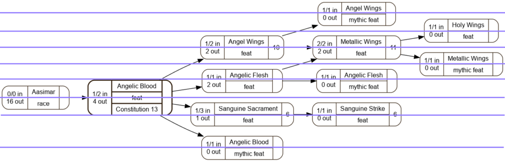
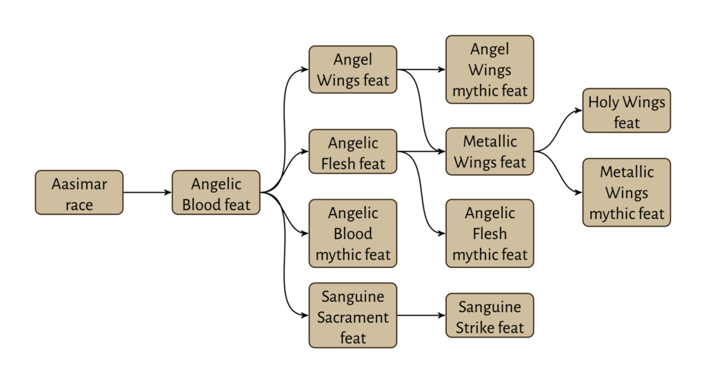
Angelic Blood, DOT Version
This is what I’m starting with, with rows marked. Eight rows and five columns in total, though with only 12 nodes it’s fairly sparse.
First Try: The Simplest Thing Possible
I admit, I did this one simply to show what a naive implementation would look like. It came out exactly as I expected.
Assign (x, y) positions to each node in the diagram. Each distinct ‘x’ is a column, each distinct ‘y’ is a row. Draw in a matrix, with reasonable row sep and col sep values.
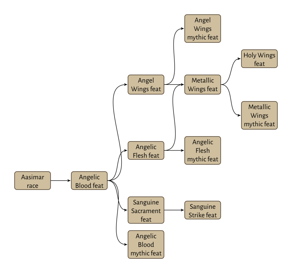
Doesn’t look absolutely terrible and it does have the relative positions the same as the original. Does not look good enough, though.
Second Try: Align Rows Where Possible
Another contrived example, I tried moving ‘half-row’ items up to the previous row. Holy Wings feat, Metallic Wings mythic feat, Aasimar race, and Angelic Blood feat nodes all move up a ‘half row’.
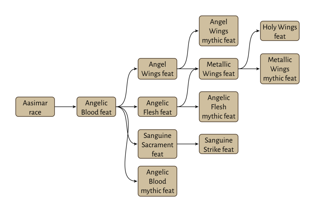
Arguably better, in that it cleans up some very wasteful white space. I’d accept it. I don’t love it.
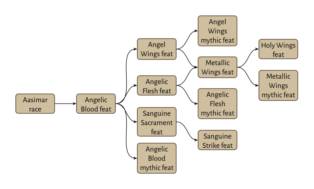
Third Try: Straight Translation
I discovered the other day that TikZ matrix has a ‘between origins’ open for row sep. Instead of saying how far to separate the row content, you can say how far to separate row origins. When you do this, you basically override the the row calculations, and can have ‘half-height’ rows.
Which is what I did here.
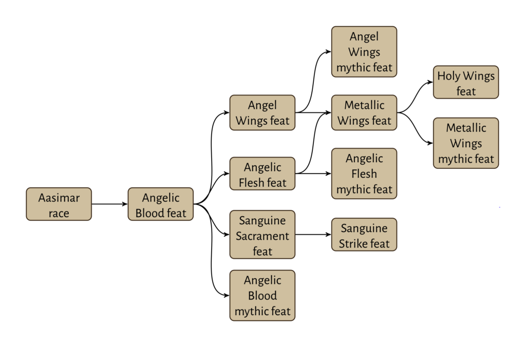
Nailed it. This has the nodes arranged exactly as the DOT diagram. I can automate this.
Refinement 1: Tightening Diagram
The third try above does exactly what I aimed to do. It looks pretty good to me, modulo a few tweaks (node width to improve vertical space needs).
If shift things just a little, I can save some more space. The left and right halves of the diagram are a full row apart. I can realign things and save myself a row.
I also swapped the positions of the Angelic Blood mythic feat and Sanguine Sacrament feat, to remove a curved edge.
I can see myself making changes like this to save some space. I don’t need to, though, it’s purely an optional refinement.
Refinement 2: Symmetry
What would happen if I did almost the same as above, but only moved things half a row.
I think I like this even more. It takes a little more space than Refinement 1, but the curved edges are more vertically symmetrical. This pleases my eye more than asymmetric “straight line plus longer curve”.
Closing Comments
I can indeed draw my DOT diagrams using TikZ matrices, and get pretty good results. In some cases I might want to touch things up some more, but I don’t have to. Even when I choose to, it should be easier than my earlier implementations.
Those were so handraulic. They’re why I moved from going straight to final release to having RAF and WIP releases.
There are some other little tweaks to be made. I see a couple of nodes that might look better with slightly wider text, improving line wrap. I kept the ‘object type’ in the nodes so I can discuss them. In practice I would leave those off feat nodes, and often for other types. If I can find other visual markers I can get away from more object type labels. For instance, mythic object headers in body text are gold rather than brown. I can draw mythic feats in pale gold instead of light brown.