Okay, okay, it’s a little rough yet, but I can see this can work. There are a few things I’d want to add (such as the option of specifying exclusions, bits of a diagram to not include, but it looks like much of my headache is going away.
These diagrams were created years apart. After I’d captured all the PRD content I put a hold on capturing 3pp content so I could focus on PZO content — content that had been published in books that had not yet made it to the PRD.
Improved Unarmed Strike, Old Version
Let’s look first at an older version of the automated diagram for the Improved Unarmed Strike feat. It contains only 3pp and PRD content, and measures 3,288 pixels by 19,640 pixels. It’s a beast of a thing.
More important to me, it’s a tangled mess. The nodes are each legible, but the edges between them overlaps heavily. As it is the image is unprintable (too big!), but that hardly matters because it is unusable.
The picture here is reduced by 50% (1,644 * 9,820 pixels) and converted to JPG just so I can get it small enough for my blog to let me upload it. It’s got some quality of life improvements (colors, mostly) I haven’t reimplemented yet, but I’ll get to it later.

Improved Unarmed Strike, New Version
This version was generated this afternoon, and includes all the content (3pp, PRD, and PZO). It’s actually taller (but narrower) than the picture above, measuring 1,937 pixels by 21,902 pixels. As with the previous diagram, I reduced by 50% (968 * 10,945) and converted to JPG so I could get a file small enough to load.
It doesn’t have the quality of life improvements (colors), but after weeding out all the nodes that are not related to Improved Unarmed Strike I find this much more readable. Despite still having many overlapping (as opposed to simply intersecting) edges, I can still make sense of this one because it’s not hard to see which is which.
- Everything in the second column has Improved Unarmed Strike as a prerequisite.
- There are some nodes in the second column with lots of children to the right that are a little hard to read, but with a close look I can make out lines well enough for it to be workable.
- Also, I trust dot to arrange things so anything near these nodes is going to be connected, and other stuff placed elsewhere — something I could not count on with the older version because of the conflicting placement needs.
- There’s also a node in the third column with lots of child objects — hi, Greater Grapple! — but it’s still manageble.
The really big deal for me with this one, though, is I can see some clear locations to break out other diagrams, and replace them here with placeholders saying ‘look over there’.
- Improved Grapple
- (possibly) Greater Grapple (I’d try with Improved Grapple alone before doing this one also)
- Stunning Fist
- Elemental Fist
- (probably) Deflect Arrows
I can’t imagine a book that has Improved Unarmed Strike that I wouldn’t have these other feats in, and pulling these five diagrams out gives me an immense amount of freedom to reformat the rest. It might still take me more than one page, there is an absolutely goofy number of feats that hang off Improved Unarmed Strike… but this is now at least doable.

Shield Focus: I Was Right
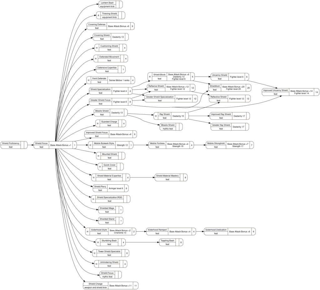
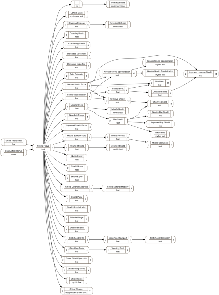
Or at least, pretty close. I didn’t make all the changes I anticipated in when I reduced the Shield Focus diagram manually… but I got almost all of them.
New Strategy, Manual

New Strategy, Automated

Not that far off, really. The nodes are a little simpler, in that I removed the ‘scores’ cell, but the relative layout is pretty close the same. Superficially, at least; the nodes might be ordered a little differently in each column.
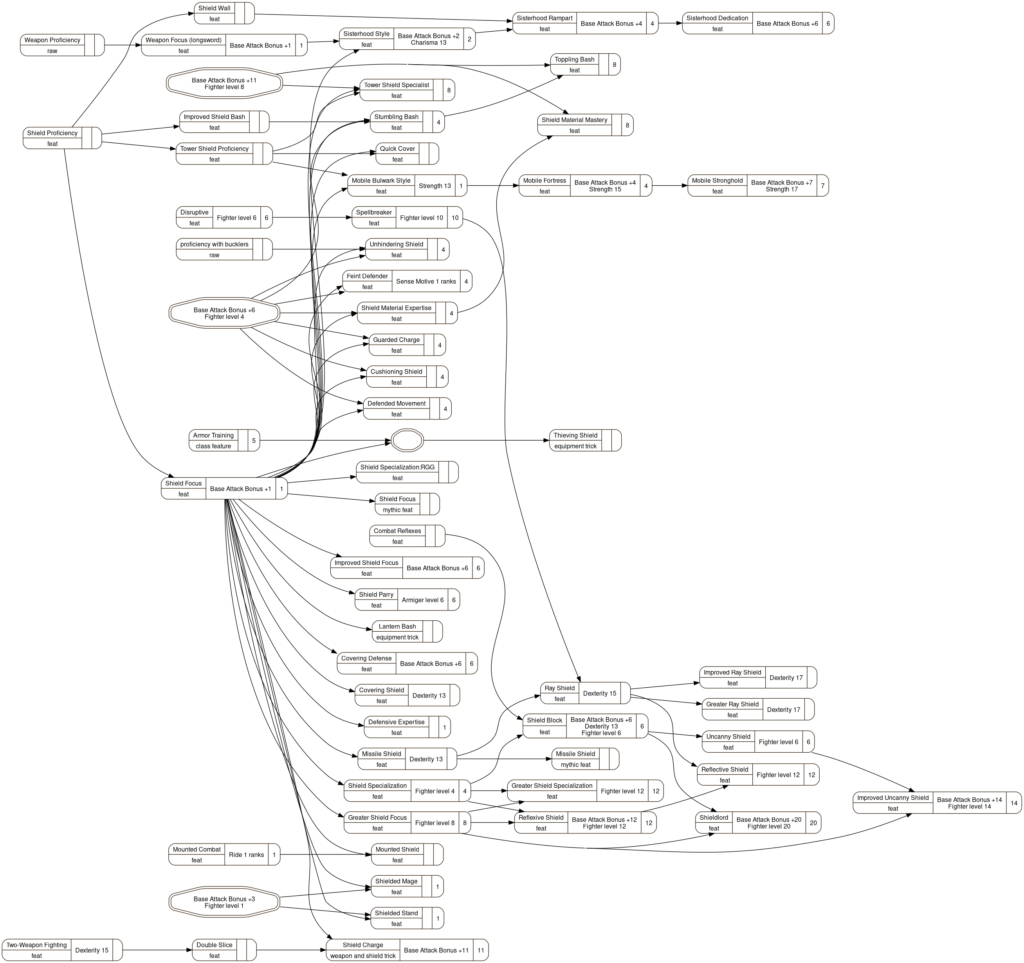
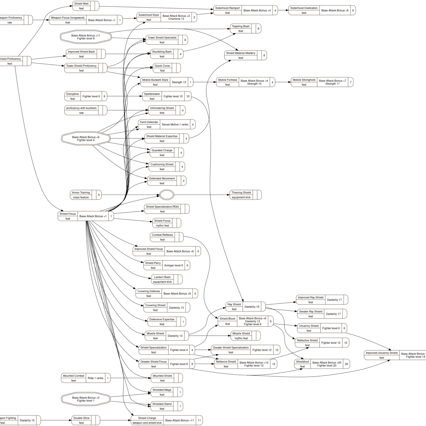
Old Strategy, Automated
Just for giggles, here what I started with, with all the nodes and edges. It’s more complete, to be sure, but I think not nearly as easy to read.

Closing Comments
My day job consists of working with data. A common trait of people in my line of work is wanting to present all the data… and that can be a disservice when it leads to overwhelming the recipient. In this case the volume of information and the complexity of presenting the Full Thing can move things from ‘useful’ to ‘unusable’.
I’m still learning to cut things back. I recognize that telling people enough is often more valuable than telling them everything… but old habits die hard.
This looks like it makes a strong case for simplification, though. With only a few small changes to my diagramming strategy I reduced the single biggest, gnarliest, and ugliest diagram in my inventory to something that actually… looks okay, is simplified to be point of being readable, and I can see ways to fairly simply break it up into a series of smaller, much more useful diagrams. I’d be creating those diagrams anyway, but now I can see what a difference it would make here, and how it can be managed. I actually have a hope of getting this thing into my books.
At least, after I make a few code changes to let me replace subsections of the diagram with callouts to other diagrams.
