Closing Comments
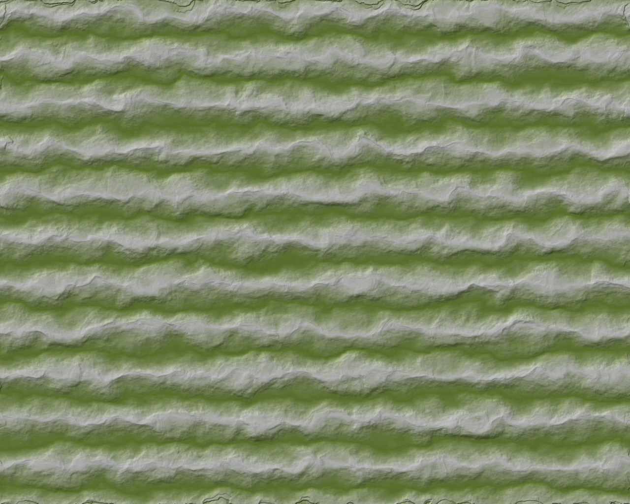
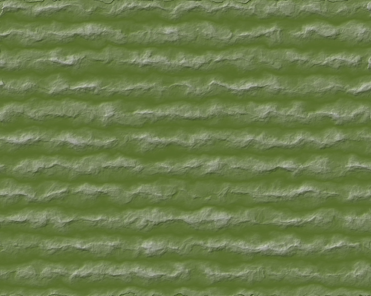
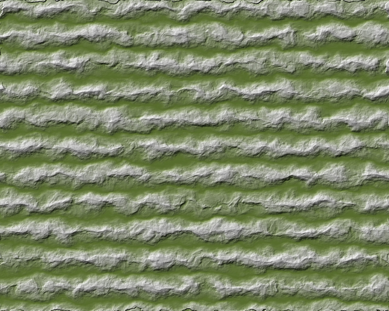
Sometimes, when you have artifacts that attract the eye in unwanted ways (such as unusually straight lines and consistent values), a few simple adjustments can do a lot to make them go away. Just by using a few noise layers, a couple of blending modes, and displacement mapping (I won’t count bump mapping, since that would be done in all cases to make the mountains here ‘pop’) you can quickly and easily make them go away.
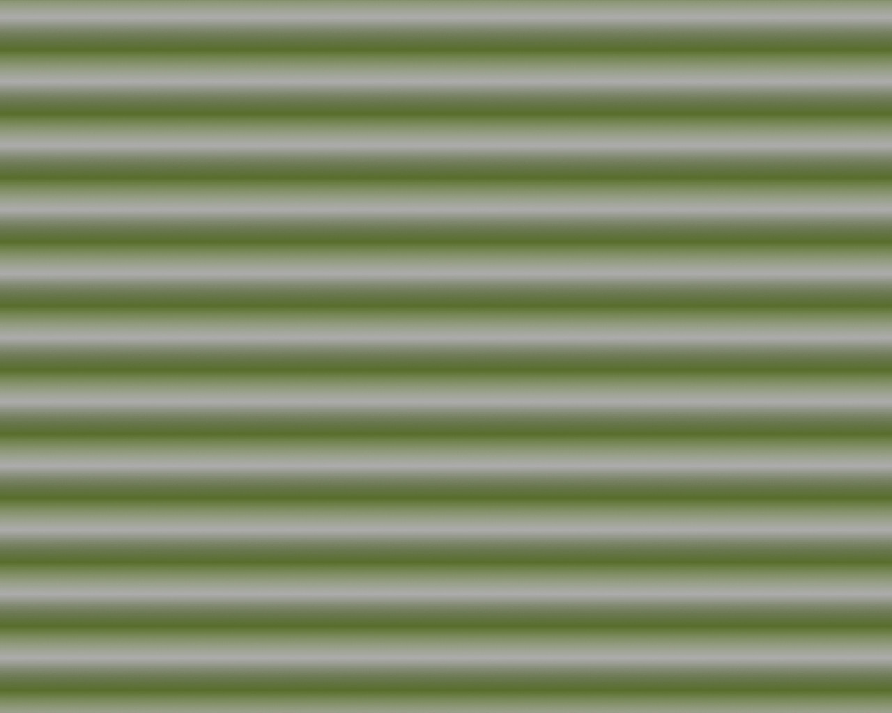
I went from the most boring mountain ranges ever
To several versions that still look like mountains and retain the same general path, but are more pleasing to my eye:
There is still some experimentation involved in all maps. The degree or combination of bump maps, the color palettes used (I’d usually include some brown in this), finishing touches such as snow caps, and so on. The same basic principles carry through all the methods shown here.
Also, by using the same noise layers and settings, it’s possible to use multiple methods on the same image. The ‘multiplied’ versions gave the best peaks and I used those bump maps on all the maps to give them a little more pop, while remaining consistent with the other results.
Pingback: Revisiting the Mountain Tutorial, Drawing the Initial Landform | In My Campaign - Thoughts on RPG design and play
Pingback: Several Mountain Ranges Together | In My Campaign - Thoughts on RPG design and play
Pingback: Touching up the Mountain Colors | In My Campaign - Thoughts on RPG design and play