Multiplied, Equalized, Displaced… and Corrected
The last variation is a bit longer than the others, obviously because it has more steps.
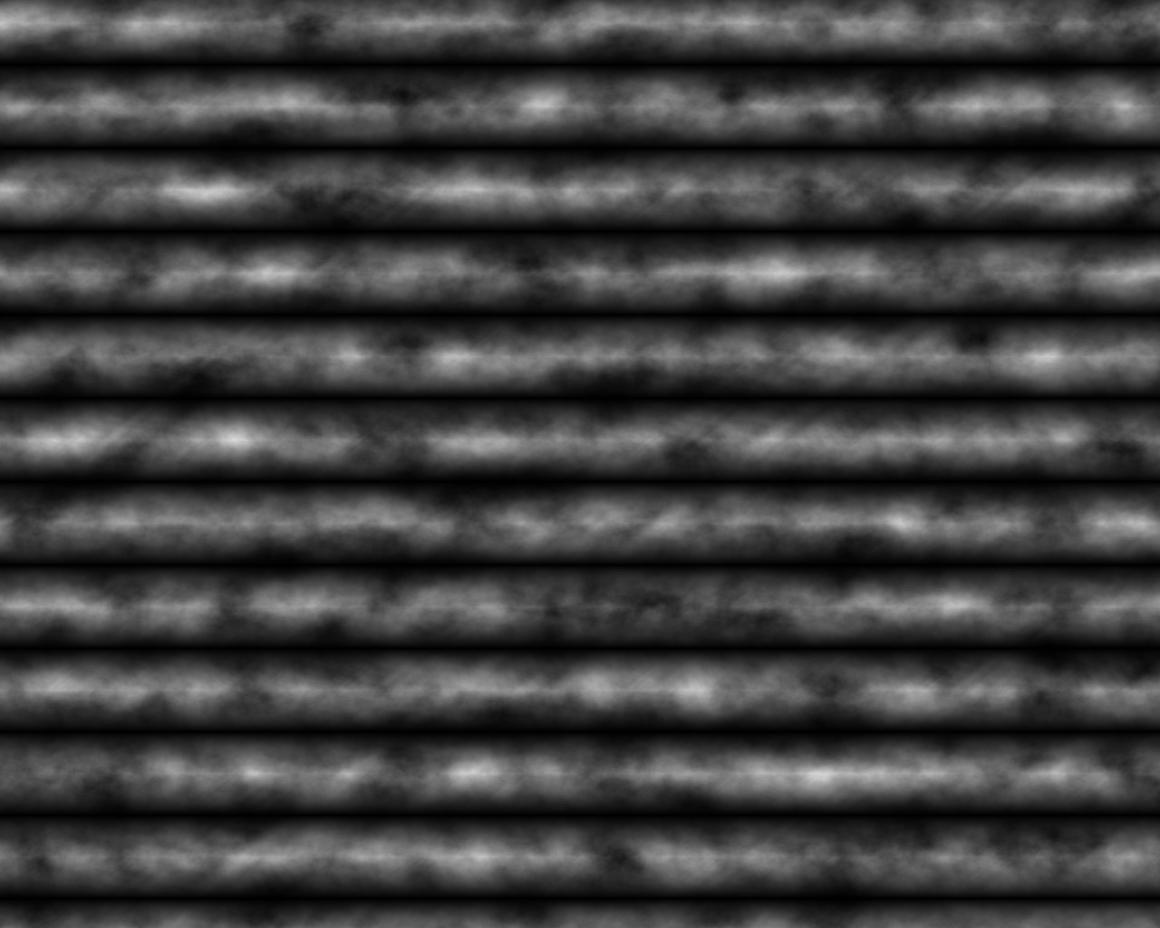
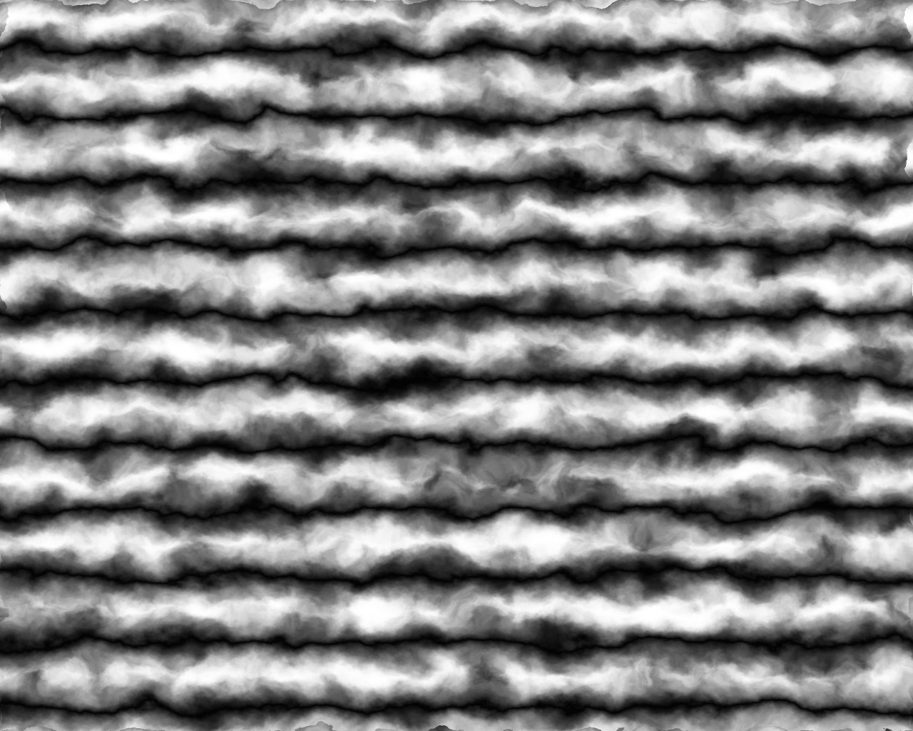
First, I take the multiplied height map from the previous example.
This has the following histogram (graph showing relative frequency of different values present in the image).
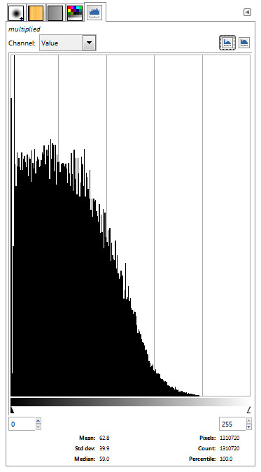
It is very easy to see that almost all the values are less than half the range. in fact, the mean is 62.8, slightly less than a quarter of the maximum value, and the median is 99, well under 50% grey. This histogram illustrates why the ‘multiplied’ version of the mountains has so many low areas (so much low area? Neither one sounds right). Using the color equalization function (color -> auto -> equalize) stretches the values out so the image is closer to balanced between light and dark.
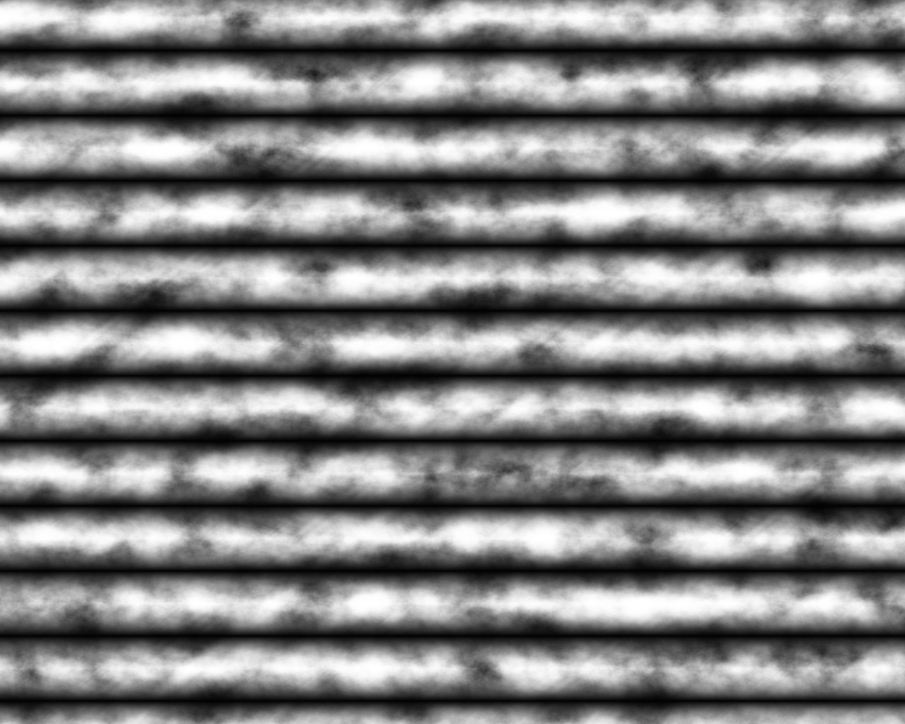
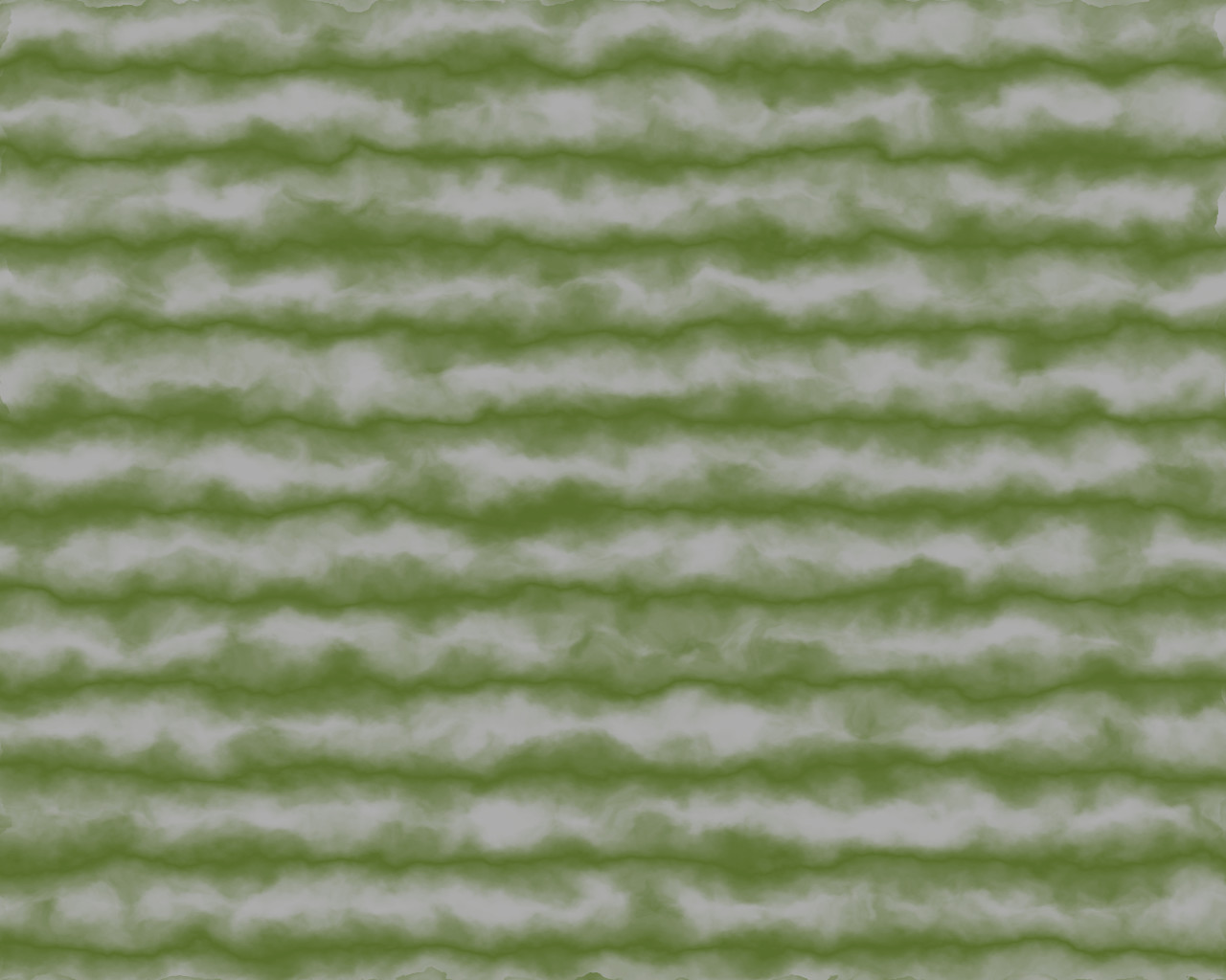
I can see already that we’ve got regions that are totally blown out. No worries, there’s an easy fix for that I’ll show later.
The histogram looks pretty unnatural, but illustrates a more balanced image.
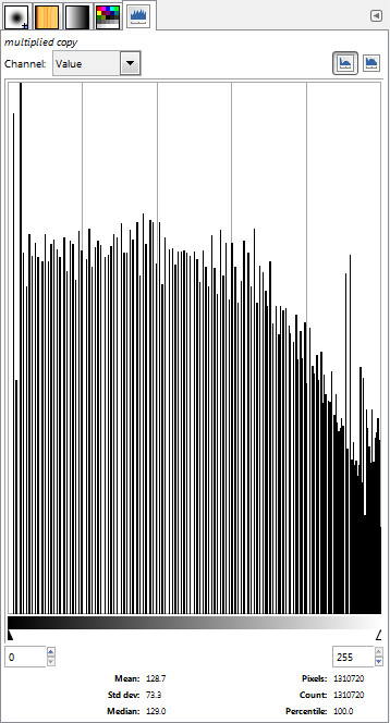
The mean is now 128.7 and the median 129, both very slightly more than 50% grey, and there’s a wider standard deviation is about twice what it was before (79 vs. 39). The image has a few problems, for my purposes, but I can work with it.
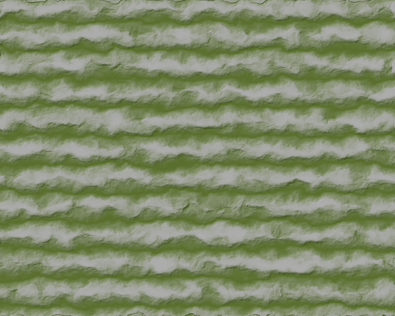
First, let’s displace it. Same noise layers and settings as before.
Blowouts… blowouts everywhere… but I can see the mountain ranges still demonstrate the ‘bigness’ I want and variation in the ridge line heights and positions.
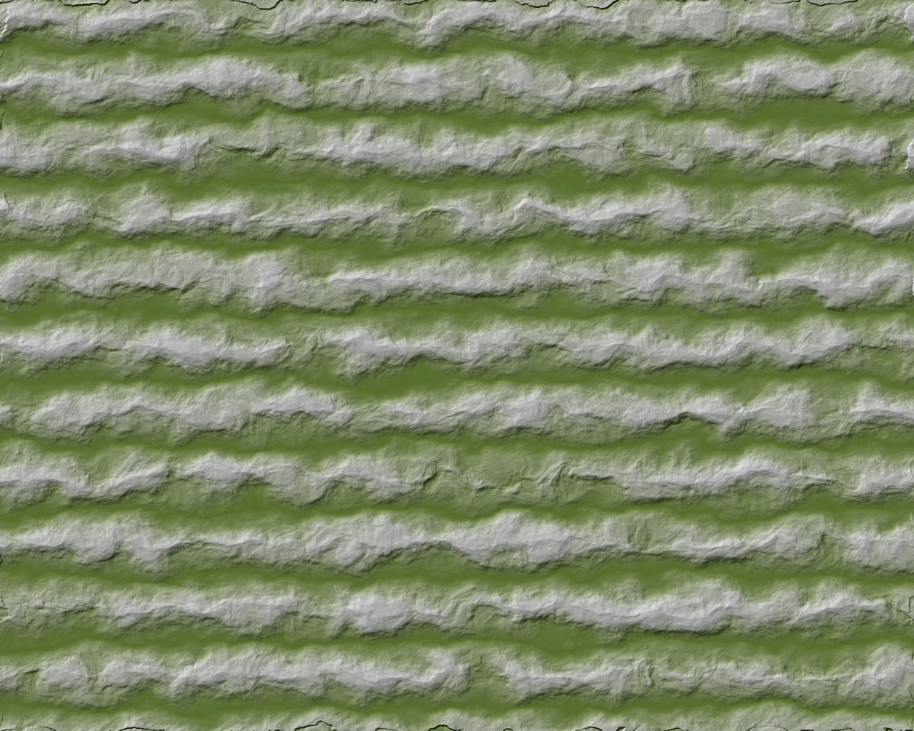
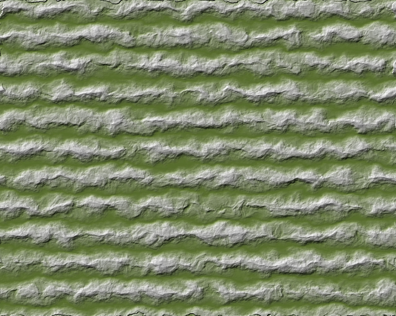
Color it.
Blowouts aren’t quite as pronounced because the colors are more similar, but I’m pretty sure they’ll be brought out by the bump map.
… and I was correct. Plateaus are the highest form of flattery, I suppose.
Sorry.
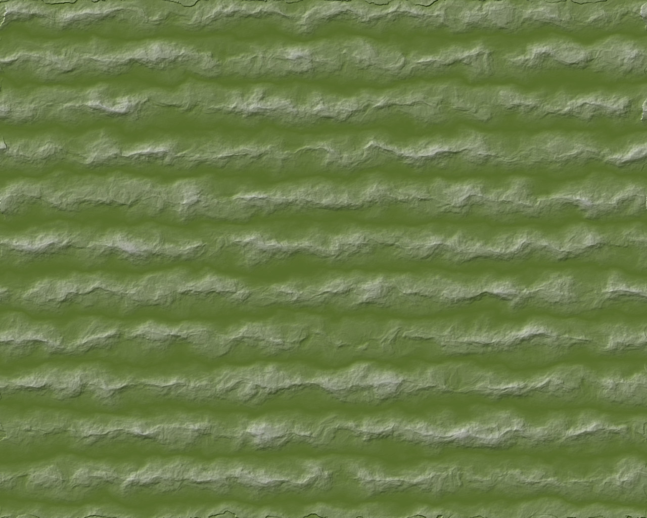
I mentioned an easy fix earlier. By (absolutely no) great coincidence, I used the same noise layers and displacement map settings for everything. I’ll just grab the bump map from my ‘multiplied displacement’ mountains and drop it on top.
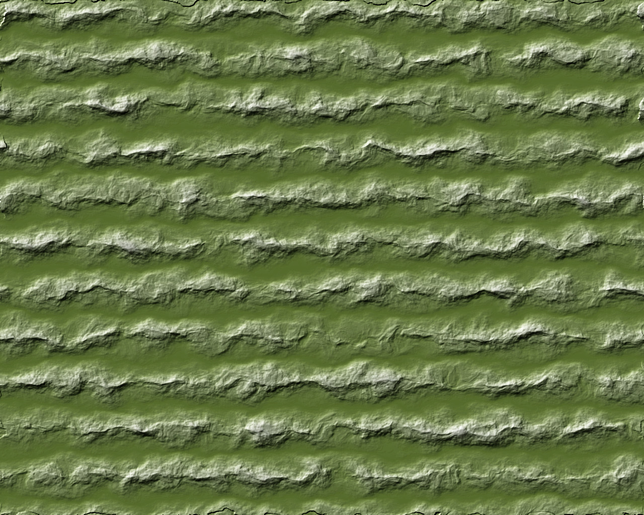
This gives some texture on top of the mountains and masks the blown-out plateaus. I like it, what happens if we do that twice? Doubling the additional bump map layer…
A bit stronger yet. I might not use this all the time, but I can see using it sometimes. The not-equalized, not doubled-bumps version is rather more subtle and appropriate for many maps, this is more bold.
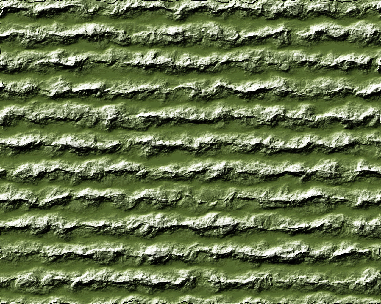
Of course, you could split the difference, as it were, and double the bump map on the multiplied not-equalized version.
This brings out the mountains more. Be cautious, though; doing this too much does bad things.
After adding the bumps layer five more times, the northwest faces are getting blown out and the southeast faces lost in shadow. An interesting effect sometimes, and I’ve deliberately used it on occasion, but I think not what we want here.
Pingback: Revisiting the Mountain Tutorial, Drawing the Initial Landform | In My Campaign - Thoughts on RPG design and play
Pingback: Several Mountain Ranges Together | In My Campaign - Thoughts on RPG design and play
Pingback: Touching up the Mountain Colors | In My Campaign - Thoughts on RPG design and play